
Cassie Dull (@cassdull) is assistant director of communications, online at Park Tudor School, an independent school in Indianapolis, Ind.
Why have infographics become an integral part of so many institutions’ communications? I see them in almost every annual report, many fundraising appeals, admissions materials, news sites, blogs and even on Instagram. CASE even has a library of online samples of infographics (login required).
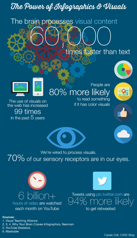
Infographics are popular in today’s technological world because we are becoming more and more dependent on visuals to quickly convey and process information. We don’t have the time or attention span to read a full paragraph or to scan a page full of numbers. On average, we read about 28 percent of the text on a page.[1] But if that information is represented visually, we pick it up right away. In fact, the brain processes visual information 60,000 times faster than text.[2]
Back in the day (i.e. less than 10 years ago), text ruled the web. Bandwidth limited the download times of images and (gasp) videos on websites. Now, we crank out huge background images for responsive sites that download in milliseconds on a mobile device, we upload 100 hours of video to YouTube every minute[3] and we tweet pictures to increase the number of retweets.[4]
As Park Tudor is preparing to publish its annual report this fall, I’ve been scouring wonderful annual report samples and giving report samples on the CASE website. Of course, a common theme among the samples I viewed is infographics. It makes sense—you have a lot of numbers and statistics to publish in an annual report. Why not make it visual and easy for your reader to understand?
Here are a few inspiring examples:
- Emma Willard School
- College of Charleston
- American University: Pushing Boundaries
- Memorial University of Newfoundland
Now that you’ve scanned through this blog post in an attempt to learn about the power of visuals, check out the infographic below and see how much more quickly you pick up the information.

Infographics, like everything else, can be good or bad. The ones that work for me are those that use the tool of visual space to show relationships. Infographics that simply prettify the type and throw in a few visuals lack this dynamic. Reading them is tantamount to reading a list — albeit an illustrated one — in which each item is discrete and unrelated; this as opposed to a sentence or a paragraph in which a coherent and memorable concept or a story is related. Go to Edward Tufte for great examples of visual displays that are functional as well as decorative.