
Betsy Robertson is a national account executive at Lane Press (@thelanepress)
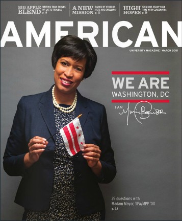
The redesigned cover of American University Magazine features a bolder masthead and newsstand-like cover lines.
I pledge allegiance to the team at American University Magazine, and not just because the publication’s nameplate lends itself to all manner of patriotic puns. No, I admire the flagship alumni magazine of American University because the book boasts an underdog story worthy of considering if, like many college editors and designers, you’re part of a small staff with limited resources and a lot of imagination.
Maria Jackson and Adrienne Frank, art director and managing editor, respectively, of the Washington, D.C.-based book, have done in less than three years what some higher education communicators strive their whole careers to do: Take an already decent alumni magazine and transform it into a publication that is now one of the best in the business.
It all started in 2012, when American’s staff tackled an in-house editorial and design overhaul, Frank and Jackson explained at the CASE Editors Forum, held March 25-27, 2015, in Philadelphia, Pennsylvania. At the time, the book’s look was dated—its glossy paper felt cheap, the production process was chaotic and an internal reorganization had created turmoil. Jackson and Frank were part of the in-house team that re-envisioned the magazine, resulting, among other improvements, in the creation of a dozen reader-friendly entry points, known internally as “anchor pages.” As part of the magazine’s architecture, anchor pages act much like departments, ramped up to invite participation from readers and streamline editorial planning. American’s anchor pages include:
- “Metrocentered,” which consists of a full-bleed photograph extending over a two-page spread. In each issue, the shot focuses on a different stop on Washington’s Metro transit rail line. The photograph typically incorporates alumni who live and work in the corresponding neighborhood and readers are invited to submit stories about their own Metro stops.
- “10,000 Hours,” a timeline that serves as an ingenious way of presenting alumni profiles. Riffing off author Malcolm Gladwell’s formula for success—being born in the right place and time, and investing at least 10,000 hours in pursuit of a goal—“10,000 Hours” chronicles the careers of American’s high-profile graduates with a one-page graphic; an illustration replaces the typical studio mug shot.
- “Unpacked,” which lists personal objects in an alumnus’ office, purse, desk, briefcase or studio as a way of telling the story of a person’s life and career. In the March 2015 issue, for example, “Daddy’s Home” comic strip creator Tony Rubino tells why he wears his “lucky Communist hat” at work.
- “Donors Make a Difference,” a not-so-subtle nod to the university’s development efforts. This one-page mini-feature provides space in the class notes section for spotlighting why individuals give to the university and, importantly, what their gifts mean to American University and its students.
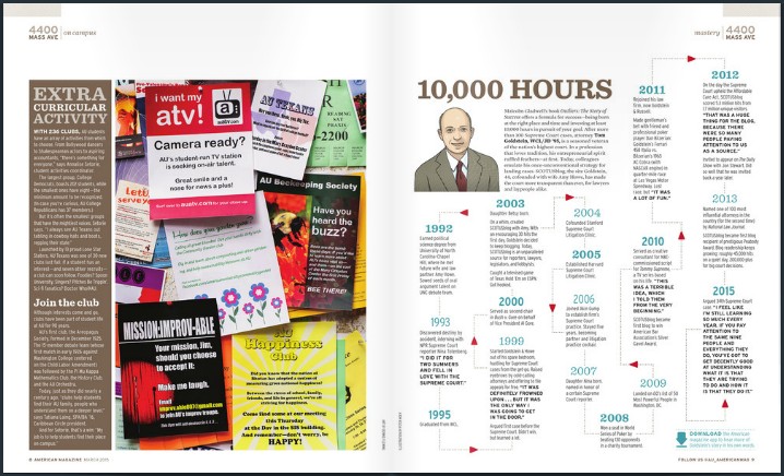
The latest “10,000 Hours” anchor page chronicles the career of Supreme Court-focused attorney and American alumnus Tom Goldstein.
How to get started on creating anchor pages for your alumni magazine? Frank and Jackson encourage fellow alumni editors and art directors to seek ideas from other alumni publications as well as newsstand magazines, then adapt them based on your magazine’s goals and even your university’s brand. Anchor pages may be sprinkled throughout the book to provide variety and pacing.
CASE Circle of Excellence judges have described the American magazine makeover as a “quantum leap forward in storytelling, design and art direction,” honoring the book and its staff with a 2014 CASE Circle of Excellence Grand Gold award for magazine publishing improvement.
“The overall unity of the design is perfectly in line with American’s “wonk” brand, and the magazine smartly embraces both its iconic geographic location and unique audience,” wrote the category judges. “The redesign process is often fraught with competing interests and institutional priorities. Rarely do these factions come together to offer such a consistent voice and ever-present focus on the audience.”
